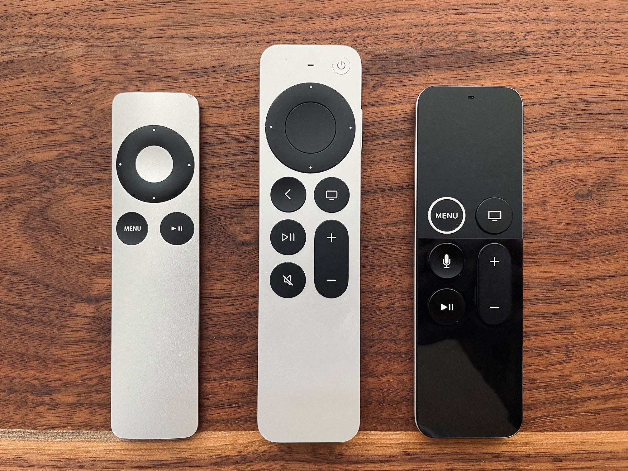
Siri Remote, Gruber's Review

I wanted to take a similar shot but my aluminium remote was lost. Read the Gruber’s review, it’s good. Here are some quotes which cracked me up.
I never liked that black Siri Remote, but over the years — six! — that I’ve been using it, I’ve grown to truly resent it.
It’s black and has no backlighting, which makes it harder to see in the dark. I believe some people like to watch movies in dark rooms.
This review made me think, why we need a dedicated play/pause button at all? Apple is learning from past mistakes and reusing things that worked. The plastic version (not in the picture) had the play/pause button in the middle. The current remote still can be used this way, pressing the middle button pauses playback. Perhaps the idea behind the dedicated control is to be able to pause music playback while you are in some other app or home screen.