Penultimate 6 update.
Penultimate iPad app is updated. Some users are in rage and writing a lot of one star reviews. Those reviews are not valid representation of what most people think. Users which are OK or even happy with changes do not have a reason to write a review because they are already satisfied.
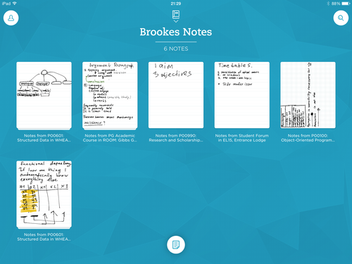
Old design looks “classy” with brown notebooks, physical pages, point of beginning and point of end without any kind of ability to separate different notes in one notebook. While using Penultimate 5 I thought this kind of UI is appropriate. Until I saw new design which respects and embraces iOS 7 paradigm. Starting from icon, all chrome are gone embracing the content.
I’m using iPad Air so I can survive without zoom mode and new full screen look makes it more possible. People with iPad mini will miss cool auto scroll function, which I hope will be added in the future. One thing which confused me is titles, but there is a switch in app’s settings.
Small amount of people are in rage, but this changes are better for most users. We need to think in a new digital way with infinity scrolling and go away from old cumbersome paper-like style UI.