Improving app icon.
It is clear that after iOS 7 icons design style has changed to become more abstract and simple. Despite some minority who don’t appreciate fresh changes, it is obvious that new look has several strong reasons for its superiority.
Firstly, new icons are more recognisible, especially, in smallest size and even more with Apple Watch. I wrote about it here: My take on new iOS 7 design. Dont judge it before you’ll try it.
Secondly, it is obvious that photorealistic rich elements are no longer essential for producing perfect iOS icon. This means indie developers no longer absolutely have to hire designers. Creating icon is a crucial process and should be taken seriously. App icon will affect sales. People make a decision based on an icon.
Altershot Example.
Here is my personal experience will be shared. All opinions and tastes are of my own and may be freely argued by reader.
My first mistake was to start creating a final version. I should do more sketeching and thinking. It costed me a lot of time redoing all over again.
Reiterating is an essential part of the process, however it is much more easier to work with draft than with finished version. Try to create rough sketch. When you’ll feel ready, attach it to your app and try to look on device. Compare it to other apps. Is it stands out? Does it demonstrate app purpose? Is it looks native? What can be improved? Then sketch again and again. I tried to show off my work to other people and this is not helped me but still worh to try.
I’m using Pixelmator for about a year. I can’t stand Adobe products because they are not native enough, slow on updates, ugly, hard to use and have too many features. Price is a point too. So after you spend some quality time drawing, create clean vector based version of your icon. For altershot I picked 1024 canvas resolution but it is better to work on 1024 * 4 = 4096 in case Apple will raise the bar at some point in the future.
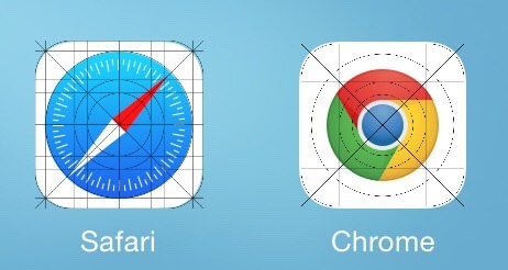
I like following rules and not being a jerk with my design. Google, I’m talking to you. Look at Chrome and Safari icons:
At the end, download iOS 7 grid and align your icon vector objects properly. Do not forget to save original multi layer vector based file in case you will need to change something. Do not rasterize your graphic elements in the original file.