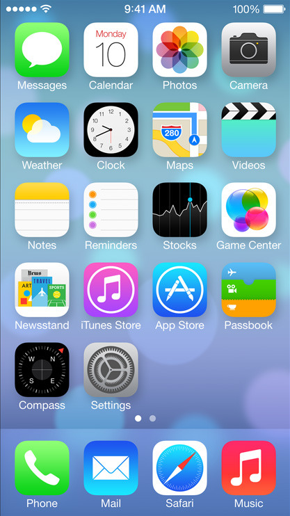
New iOS 7 design — don't judge before you try.
It is easy to hate. When I saw leaked mockup I thought: — This can’t be serious, looks not professional. When I saw WWDC keynote I thought: — Icons look bad. But some part of me didn’t wanted to believe that this is a misstep.

So I asked myself: — How it would feel in your hands? Apple hinted on their website: designed to work beautifully not designed to look beautifully. Are you familiar when some gadget looks beautiful on a shelf and after you’re starting using it — you’re getting tired and bored? Jonathan Ive has balls to built something that’s not trying to seduce you by first look. This is doesn’t mean he didn’t worked hard enough or that he has a bad taste. Johnny knew what he’s doing.

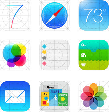
I think the secret is what people are not noticing from first glance — the grid system. Apple already used that with iCloud icon. New design brings a natural order. You know things like symmetry, math, golden ratio and biology — all this stuff our Universe built on.

When you’re looking at Netbot or Fantastical apps — you’re thinking: — Icon looks perfect. Are you following? This is like looking at glamorous magazines with beatifull people. Fantastical icon with multiple colors, squeres and pages. It tells you that you’re have a lot of stuff ahead. It makes you feel bad because you’re not perfect. Fantastical icon so cool that you loosing your cool, Calendar becoming an unreachable ideal gorgeousness.
I want to use iOS 7 because I hope it will fill better. New childish icons makes you more confident in using your favorite apps. They looks like some kid painted them — so it makes you feel like: — If this icon looks so easy I can handle this app.
By the way, all other things are not so controversy. I looked at all iOS 7 pictures at Apple web site and now iOS 6 looks old and unnecessary heavy. Especially Settings table view, Wheather app, horrible top blue bar, black top bar, switch buttons, glossy date pickers…
iOS 7 is a day-to-day unfamous hero that ready to help you any minute. This is a start of a new era in software design.